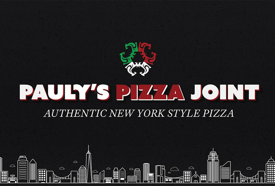
Pauly's Pizza Joint
Web, Mobile, and Graphic Design
Learn how our team partnered up with a local pizza joint and helped redesign their site to give it a modern feel and improve usability.
Learn how our team partnered up with a local pizza joint and helped redesign their site to give it a modern feel and improve usability.
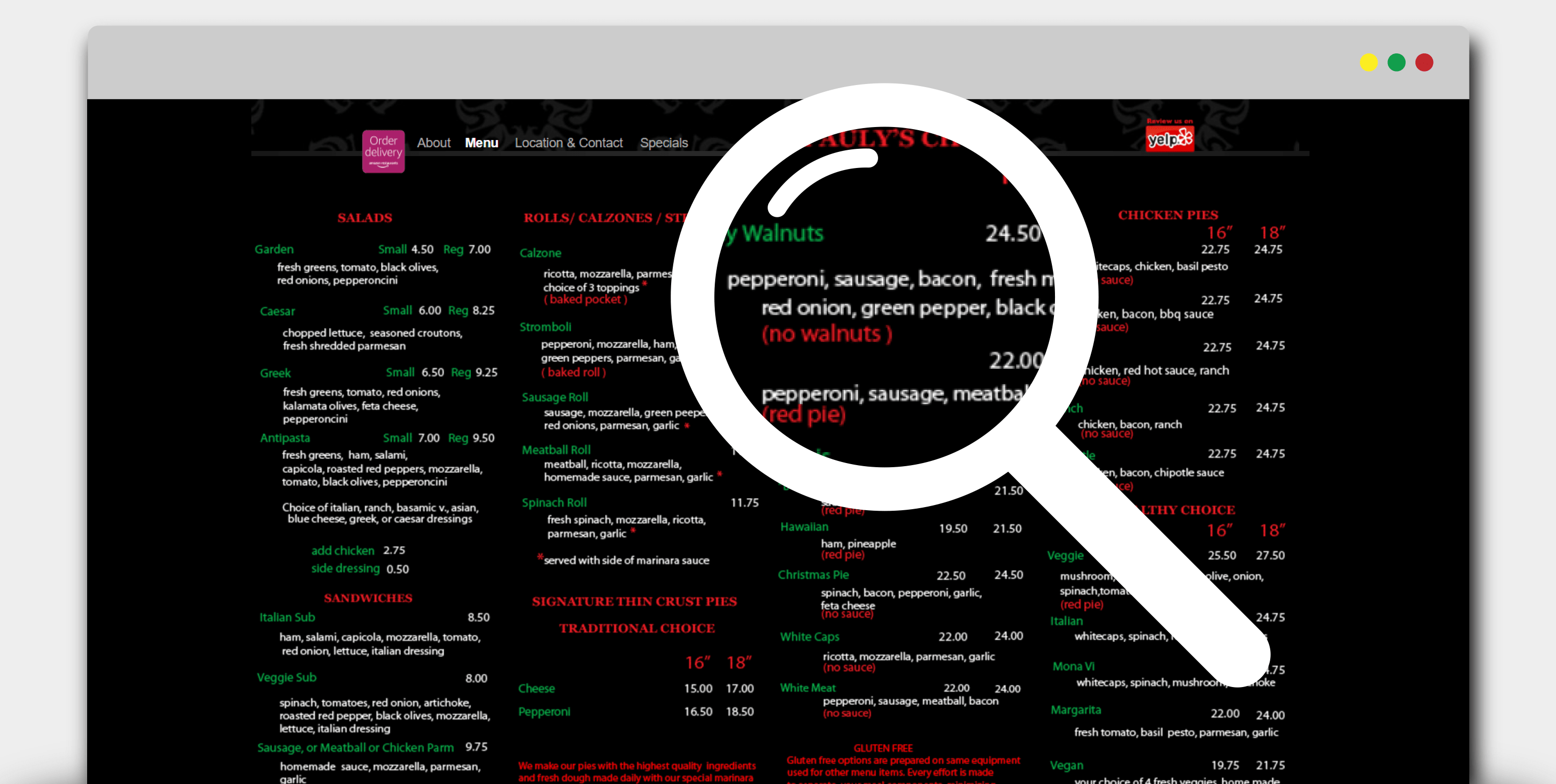
Pauly’s Pizza Joint is a local favorite near the UCSD campus that has great food, friendly service, and chill atmosphere. The outdated site was hard to navigate, difficult to read, and didnt match the friendly/authentic personality that was Paulys.

We had to the opportunity to interview with Pauly, Mona, their staff, loyal customers and even the previous webmaster to get a better understanding of what we could do to improve the site.
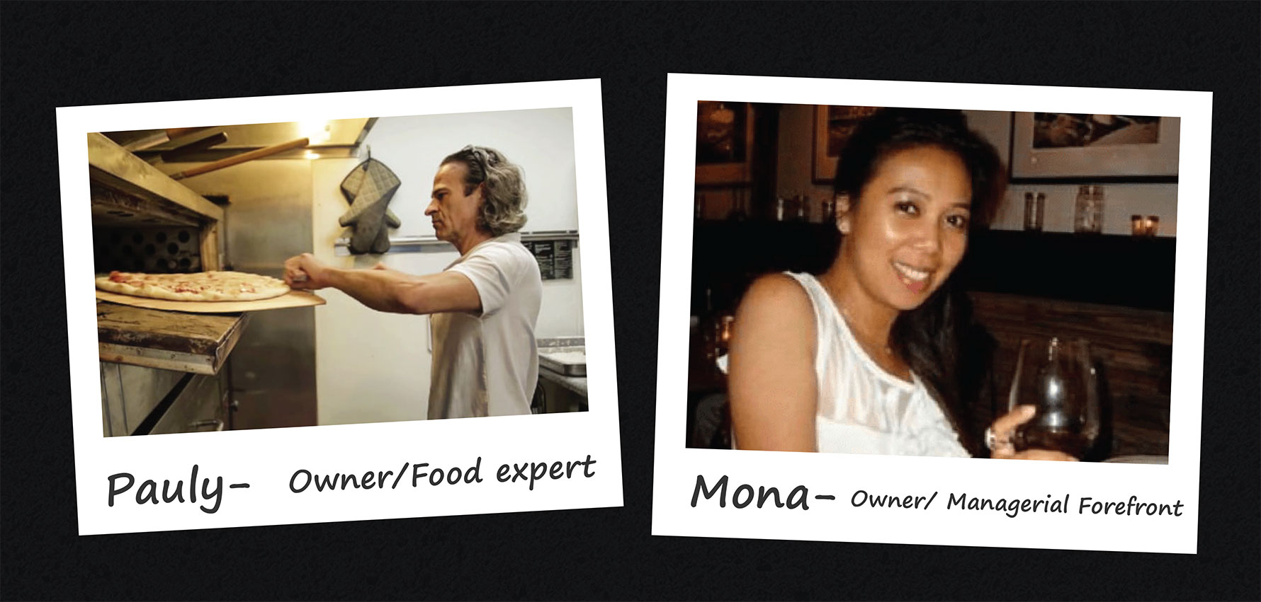
After interviewing both Mona and Pauly we had gathered some important facts about the restaurant-
1. Catering is 40% of revenue (but no options available on site)
2. Local businesses near Paulys have a physical menu on hand and call for catering
3. Catering is set up through Mona via text or email
4. Peak hours of business are between 10am - 2pm
5. Majority of customers are factory workers or military, but also a good portion are students.
6. Pauly really liked the red, green, white, black color scheme and authenticity was everything
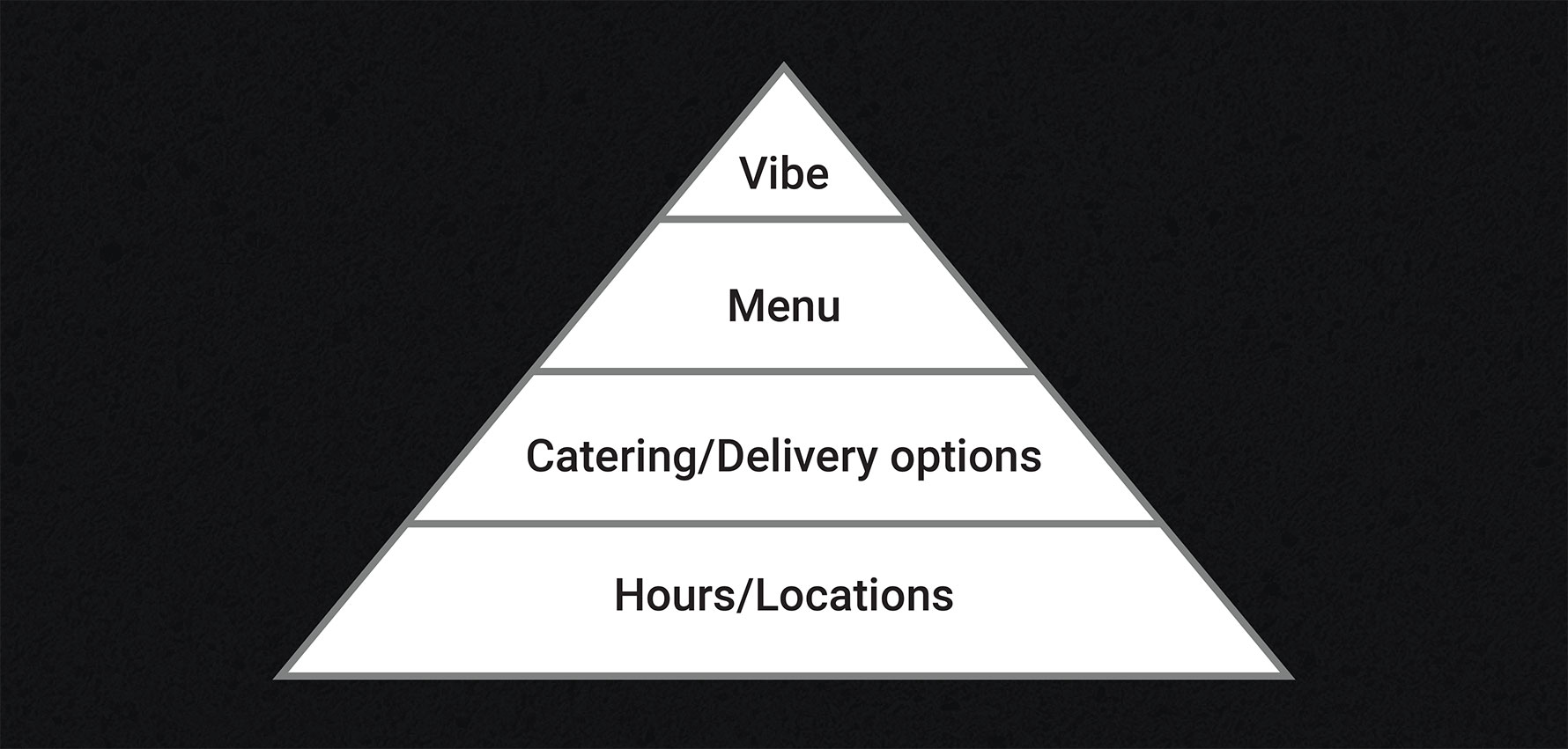
Mona and Pauly were able to direct us to regular customers that agreed to be interviewed and allowed us talk to customers in the restaurant. We also took the intiative to ask students unfamiliar with Paulys what they look for when searching for restaurants around the area. These were the top things that came up.
1. Hours
2. Location
3. Catering/Delivery options
4. What is there to eat?
5. Majority of people look for restaurant with phone
6. Atmosphere of the restaurant
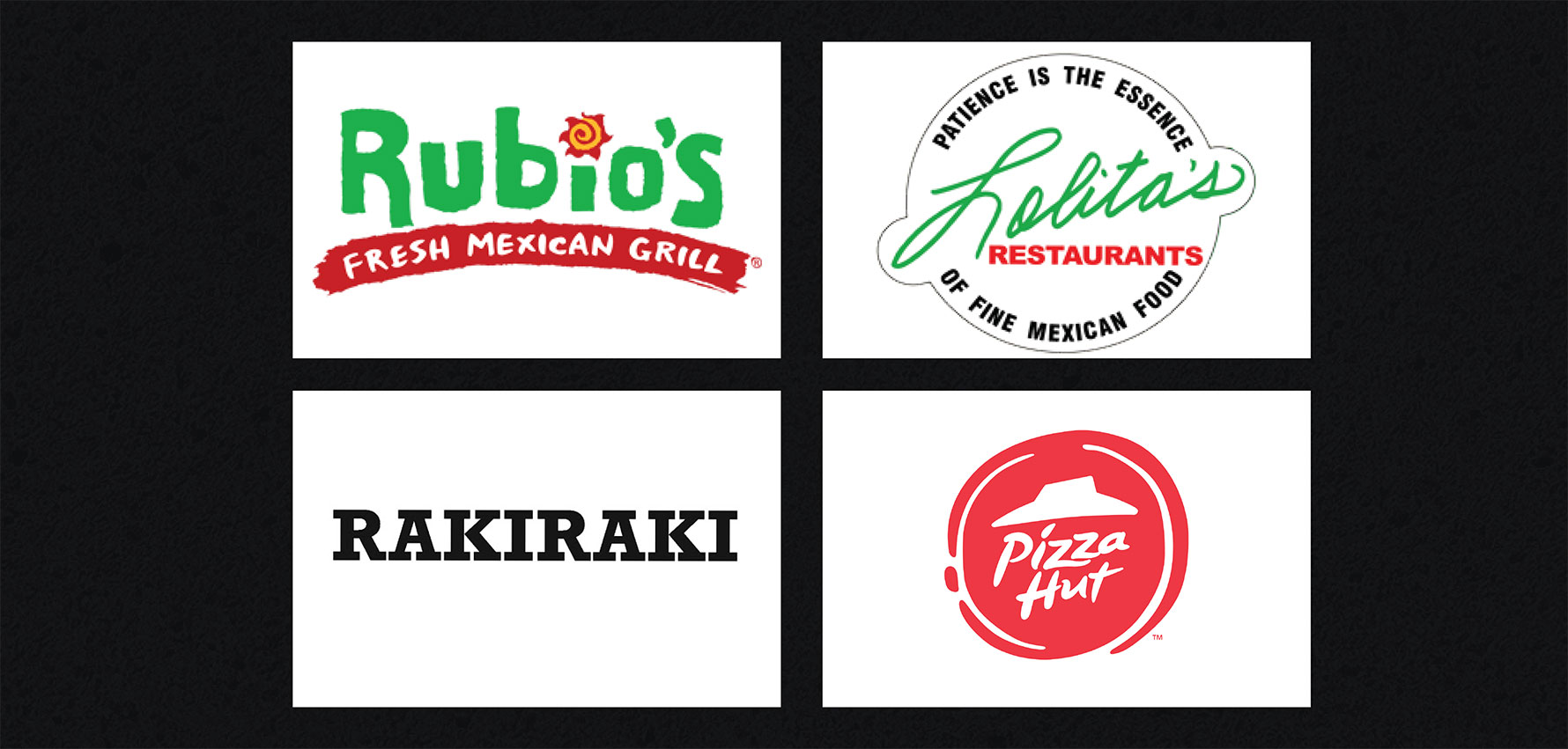
After talking to stakeholders, our team started to look at local restaurants and national chains for inspiration.
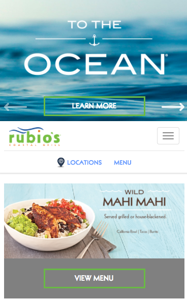
• Font is easy to read
• Menu easily accessible - as a button, and part of two navbars
• Places locations and menu at the front
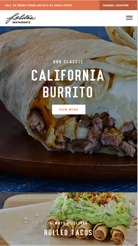
• Uses a minimal amount of colors on a white background with orange as their main highlight color and black for their font.
• The quality of the images is very crisp and high-quality making their website look contemporary.
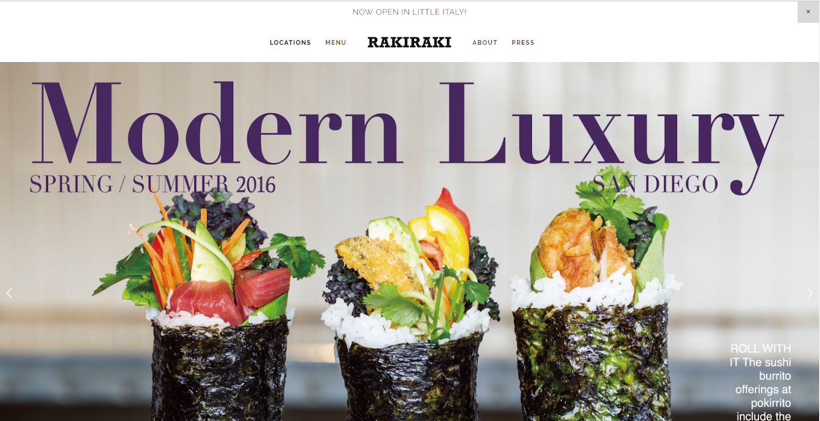
• Site has a heavey emphasis on the images and awards it has.
• Because it is a dine-in restaurant, the goal of the site is to get customers to come to the restaurant.
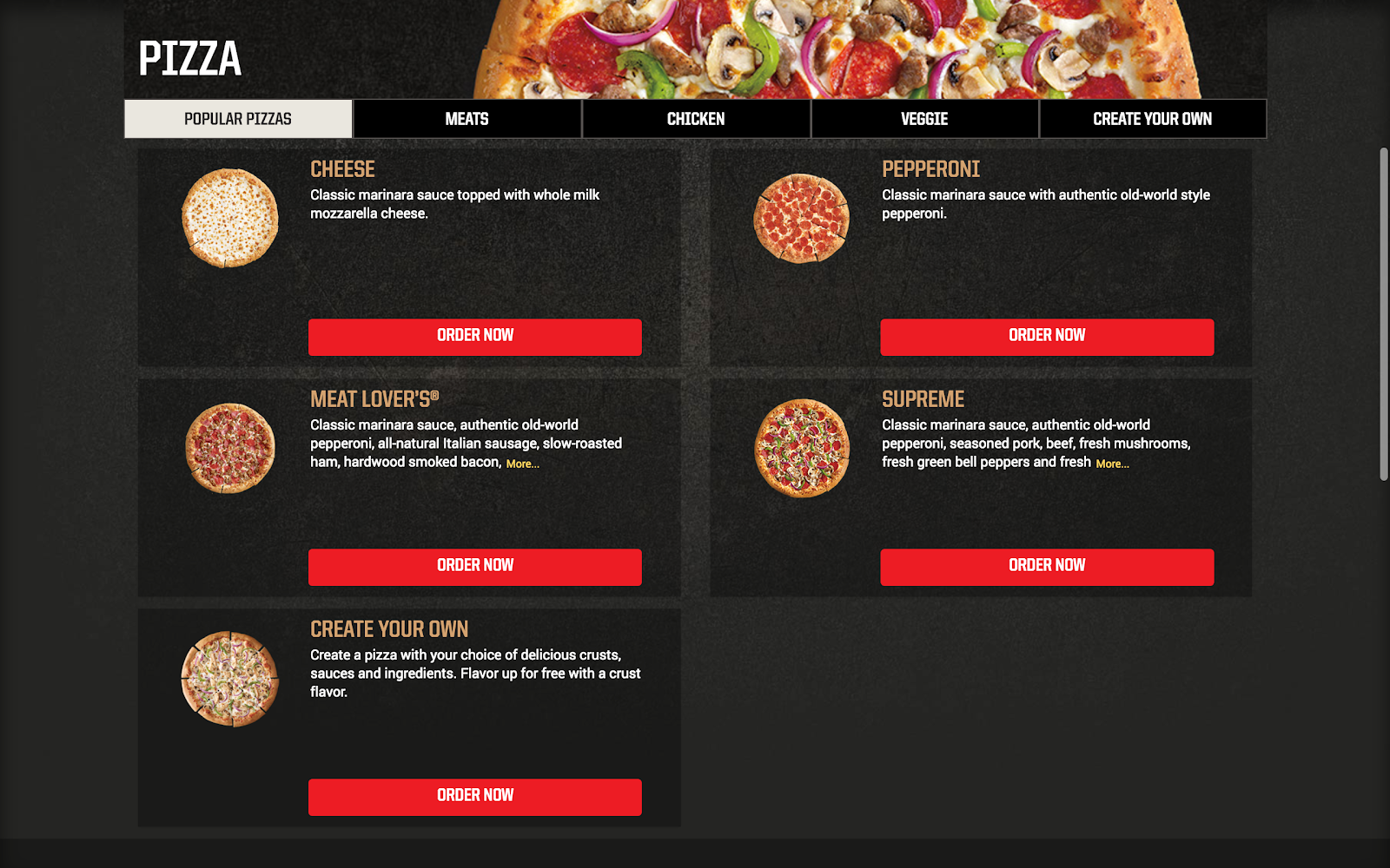
• Overall feel is dark, making the “order now” buttons pop out, but a little gloomy
• Branding seems to be carried by the color, which matches the pizza hut logo.
"We aim to revamp Pauly’s online presence by creating a mobile and desktop friendly website, with an emphasis on catering, authenticity, and readability."
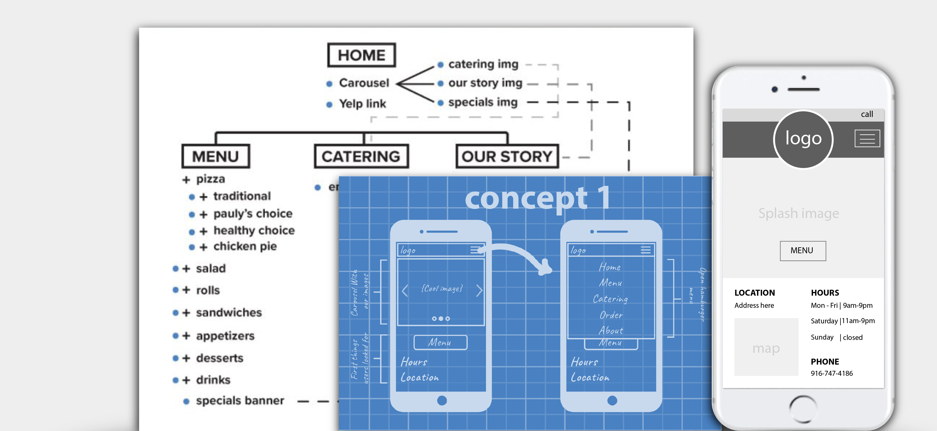
Once we had finished our intial research and creative brief we were finally ready to conceptualize our product. We started with the sites architecture to make sure the important elements customers needed were available, next we started to visualize the site with sketches and wireframes.
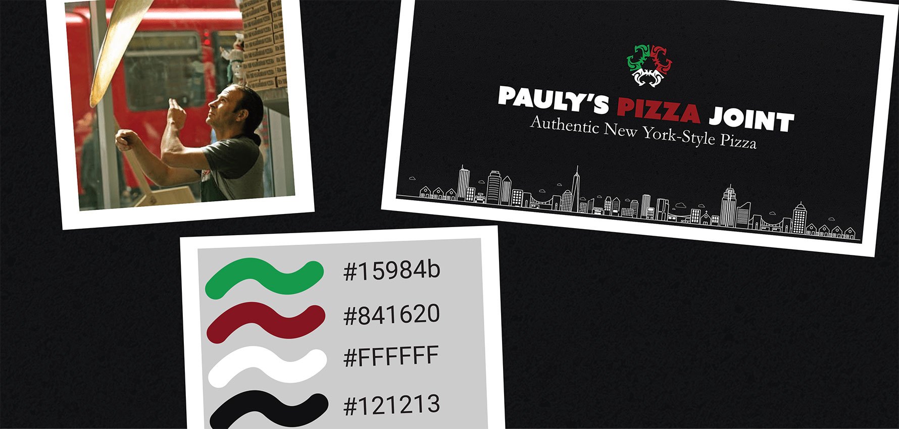
Now it was time to flesh out the brand and vibe of Paulys. From the get go we knew we had to emphasize that this place has New York Style pizza and Pauly asked us to keep the red, green, white, and black color scheme.
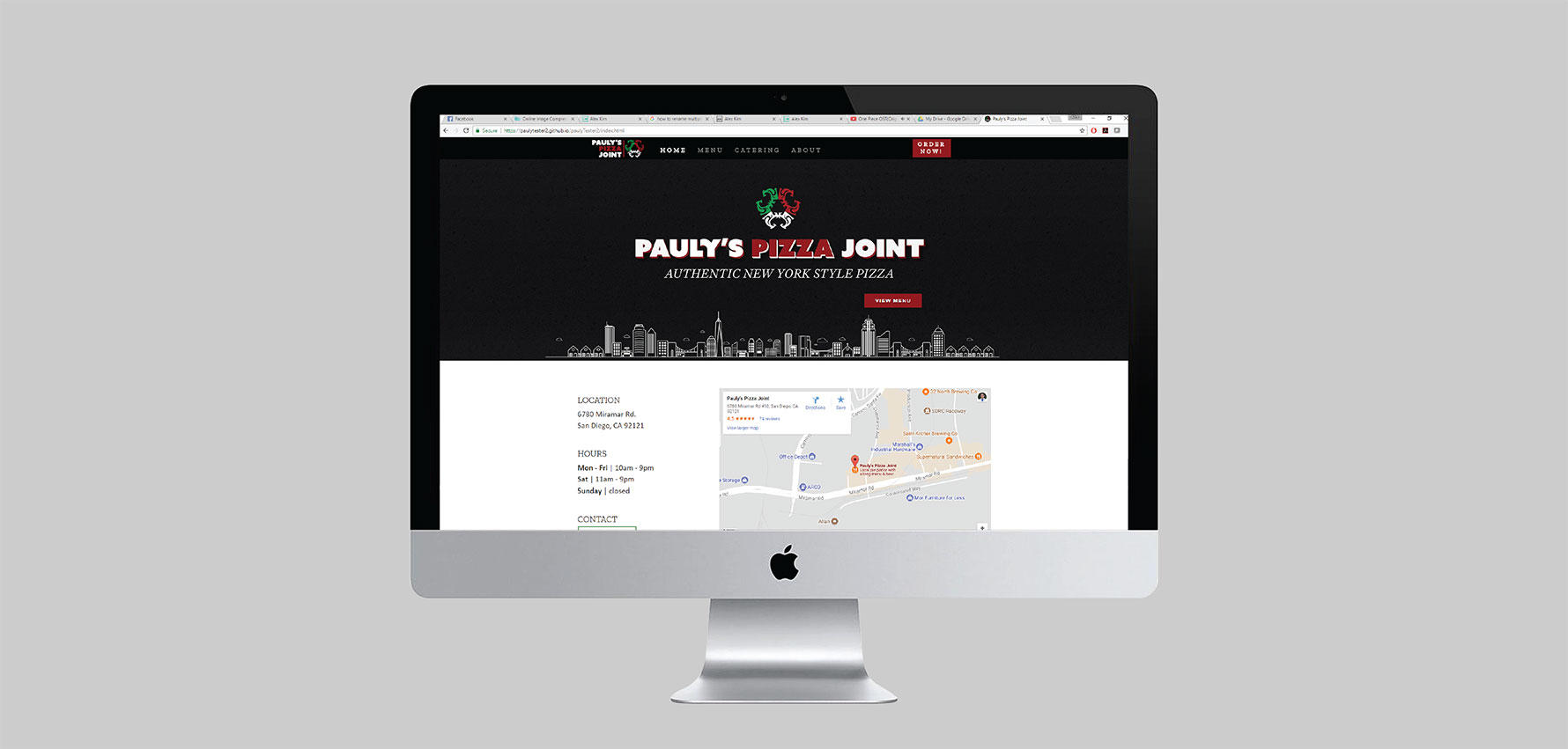
Now that we had the branding and site elements, all that was left was for our team to code the site. We built our site on gitub so that we could send it over to the original webmaster and collaborate with him.